People today can choose between an incredible number of mobile devices that vary enormously in display size and resolution. How can you ensure your app looks and handles great on all of them? Let’s talk about dimensions, positions, and layouts, and how they fit into design systems!
Absolute nonsense
Some very popular design tools do this:
It all looks nice and thoroughly specified, doesn't it? Wrong! Dimensions specified in absolute values have long been unusable for several reasons:
- Mobile device displays vary widely in terms of physical pixels.
- Mobile devices also vary widely in terms of absolute physical display size—many phones are now approaching 7 inches, while at the other end of the spectrum devices around 5 inches are more than common.
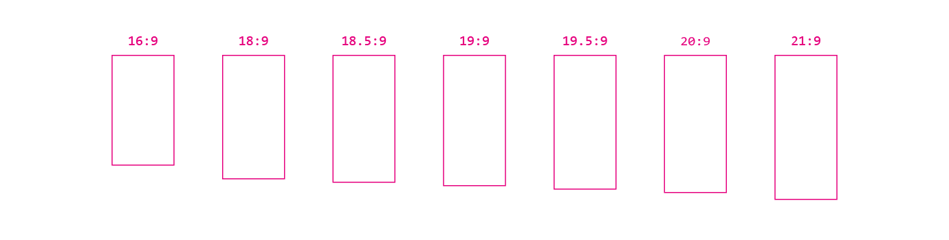
- The aspect ratios of displays also vary widely—today we can commonly see ratios such as 16:9, 18:9, 18.5:9, 19:9, 19.5:19, 20:9, 21:9, and this is by no means a complete list.
- Since the advent of retina-like displays, physical pixels have become more or less irrelevant, and instead, we have to consider units independent of actual display density.
- The amount of space your application gets on the display for rendering itself may vary depending on the presence, position, and size of system bars or display cutouts.
- The operating system may also feature some sort of split-screen mode; and don’t get me started about foldables, large screen devices, and the like.
When designing screens for mobile devices, this means that you know literally
nothing about the display, making absolute dimensions totally pointless (this also applies to platforms with a limited number of well-known models such as iOS—who knows what displays iPhones will have next year?). Hopefully, design tools will start to take this into account, but until that happens, we need to help ourselves in other ways.
Units united
So if physical pixels are no longer usable as a unit of dimension, what to use instead? Well, each platform has its own way of specifying dimensions independent of physical resolution, and unfortunately, you have to account for all of them in your design system.
For example, Android uses two units: scalable pixels (SP) for text sizes and density-independent pixels (DP) for everything else (actually, even that isn’t entirely true—as far as raster bitmaps are concerned, good old pixels are sometimes used as well, and Android letter-spacing units are totally weird). Moreover, SPs and DPs are converted to the same physical size by default, but this need not be the case if the user so chooses (for accessibility purposes).
Confused? This is perfectly understandable, but if the design system is to be usable, there is no choice but to learn how each platform handles dimensions, and then use those ways everywhere in the specs. The second best option is to use some abstract universal units and provide a conversion formula for each platform, but this way is more error-prone than specifying platform-native units that developers can use directly.
Get into position
Even when using platform-specific units, absolute positioning is still not feasible. So how do you adapt your layouts to all possible screen configurations?
The answer is relative and responsive positioning. Two things need to be specified for each component: Its dimensions and its relative position to some other component, its container, or screen. Together, these parameters form constraints that are used to unambiguously and responsively specify the entire layout, regardless of screen size, aspect ratio, etc.
Size constraints can be specified as:
- wrapping or “hugging” the content of the component
- occupying all (or a proportion) of the available space
- fixed values, but only in specific cases (e.g. icons)
Some components may have additional options. For example, a component for displaying text can limit its height to the maximum number of lines displayed, or a component for displaying images can have a fixed aspect ratio.
It might be useful to add auxiliary parameters to these constraints, such as enforcing minimum or maximum dimensions, but then you must take care to prevent conflicts with other constraints.
The constraints for width and height are independent and can freely combine the above options, but only so that the resulting size is always unambiguous.
Relative positioning is quite simple: Each component must be anchored somehow in both horizontal and vertical directions to:
- another component
- the container in which it is placed
- the screen (this option must be handled with care)
Since the application has no control over how large a display will be available (and what its aspect ratio will be), nor how large the dynamic content will be (e.g. image size or text length), it is always necessary to specify a strategy for what to do if all the content does not fit. The basic options are:
- to make the component scrollable (remember that there is also a horizontal direction, but horizontal scrolling is usually much less intuitive)
- limit the text by the number of characters or lines—in this case, it is necessary to also specify the indication of overflow (ellipsis, some kind of fade effect...)
- crop the image to a fixed dimension or predefined aspect ratio (including the specification of whether to stretch or fit the image into the resulting container)
Everything’s not relative
While the dimensions and positions of components should be specified as relative where possible for the design to be responsive, there are still situations where we need to use absolute values:
- spacings between components (or their margins)
- container paddings
- corner radii
- dividers
- elevation and/or z-index (depending on your platform, these may or may not be two different things)
- small spacings used to visually align the parts encapsulated inside reusable components (e.g., space between icon and text inside a button)
- parts of the typography specification (e.g., line-height; although in some cases these can be specified relatively as well)
For the first five cases, it is absolutely essential (as in the case of
colours) to introduce semantic dimension constants into the design system and then use them exclusively in all designs. You don't want to hardcode these values because it's easy to make a mistake when using them, and you also want to use them according to their purpose, not their value (which means there's no harm in having multiple semantic constants resolved to the same size).
So how to name these semantic constants? The first part is simple—it should always express the primary purpose (spacing,
padding,
cornerRadius,
elevation, etc.), possibly combined with secondary usage (e.g.,
padding.screen,
padding.dialog, etc.). In some cases, you’ll also need several size variations for a given purpose, so it's good to have a system for naming these variations as well, for example:
- size adjectives like
tiny,
small,
normal,
medium,
large,
huge—these work well, but don’t go overboard with quirky names like
tiniest,
reallyReallyLarge,
humongous; you need to be sure that the order from smallest to largest is always absolutely clear
- T-shirt sizes like XS, S, M, L, XL, XXL—their order is unambiguous, but if you find out later that you need another value between, say, L and XL, you'll have a problem (this also applies to the first option to a certain degree)
- clearly (this is important) dimensionless numbers without semantics like 100, 150, 200, 400, 1200—have the advantage of allowing you any number of values, you can always squeeze a new one between any two, and their order is unambiguous, but a problem will occur if this number is confused with the actual value, which is why I would recommend this only as a last resort (needless to say, the name of a constant must never contain its value)
Putting it all together, your design system can define set of dimensions such as
   dimension.padding.screen.normal
dimension.padding.screen.large
dimension.padding.dialog.normal
dimension.spacing.small
dimension.spacing.normal
dimension.spacing.large
dimension.spacing.huge
dimension.cornerRadius.normal
dimension.cornerRadius.large
dimension.elevation.none
dimension.elevation.normal
What actual values should these constants take? This is where it's also good to have a system so that your UI has a consistent rhythm. Different platforms usually have a grid defined as a multiple of some value (e.g., on Android it is 8 DP), and it's good to stick to that (so for example
dimension.spacing.normal might be 16 DP,
dimension.spacing.large 24 DP and so on) because your app always shares the screen with at least a part of the system UI, and ignoring the default grid might make your app feel subconsciously “wrong”.
And finally, what about the last two bullet points—dimensions used to visually tweak space inside encapsulated components, or in text styles? In this case (and only in this case!) I dare to say: hardcode them. Yes, I know, after all the talk about semantic constants, isolating values in one place and all that, this is unexpected, but I have two good reasons for that:
- These dimensions are implementation details of isolated, otherwise totally encapsulated components or text styles. They are completely hidden, not used externally anywhere, and not reused nor reusable.
- Especially in the case of smaller components, these values are completely arbitrary, chosen based on visual appeal, and don't have to follow a predefined grid at all (e.g., if your button looks best with vertical padding of 3 DP, just use that value).
Putting it all together
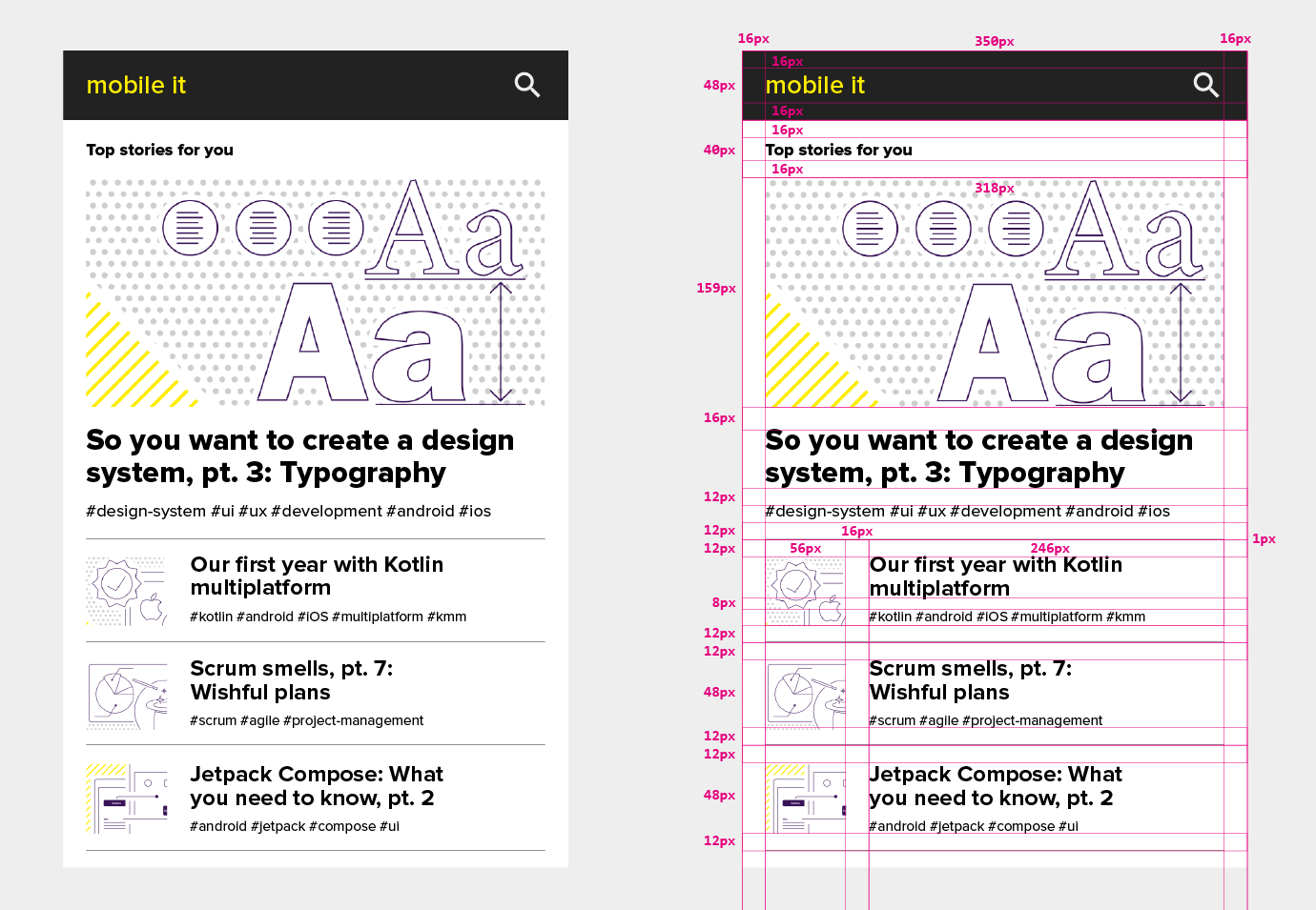
So let's apply the techniques we mentioned above to the example in the first figure:
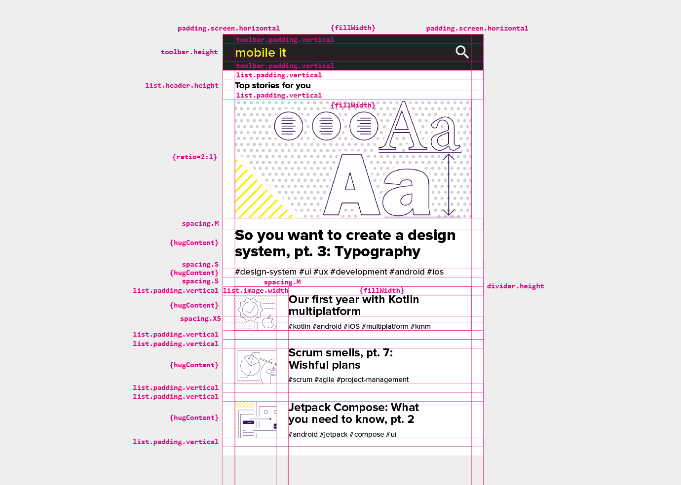
This is much better! Systematic and responsive, a UI specified this way is much easier to implement and use.
There are other things to think about:
- With interactive elements like buttons, the platform's minimum tap target size
in both dimensions must be respected at all times. This includes not-so-obvious things like hyperlinks in paragraphs of text and the like.
- If your app is running in fullscreen mode, you need to be
very aware of and careful about display cutouts, the system UI overlaying your app, etc.
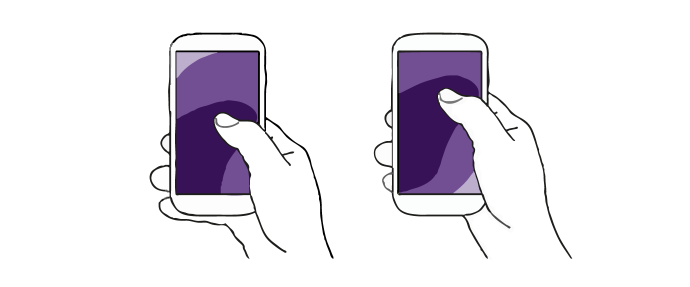
- Modern phones are getting bigger and bigger, and if you use such a device single-handedly, you can't reach the whole screen with your fingers anymore. In this case, the screen is effectively divided into several zones, which differ substantially in how well they can be interacted with. Moreover, often the place that is the most prominent when visually scanning the screen (the top left corner) is also the hardest to reach physically, and vice versa. You have to take this very much into account and design a suitable compromise. And don’t forget about left-handed people!
- Gesture implementation is another can of worms that we won't go into here. Even if your app doesn't support any custom gestures, current mobile platforms use system gestures that can interfere with your app.
- Another major topic (for another blog post maybe) is support for foldable and large displays. This is where things like breakpoints, multi-panel screens, and the like come into play, and it's a whole different ballgame.
Design your system, systemize your designs
This concludes our series on design systems. I hope it has helped to make the design and implementation of your mobile apps more consistent, easier, and more efficient, and who knows, maybe even a little more fun.